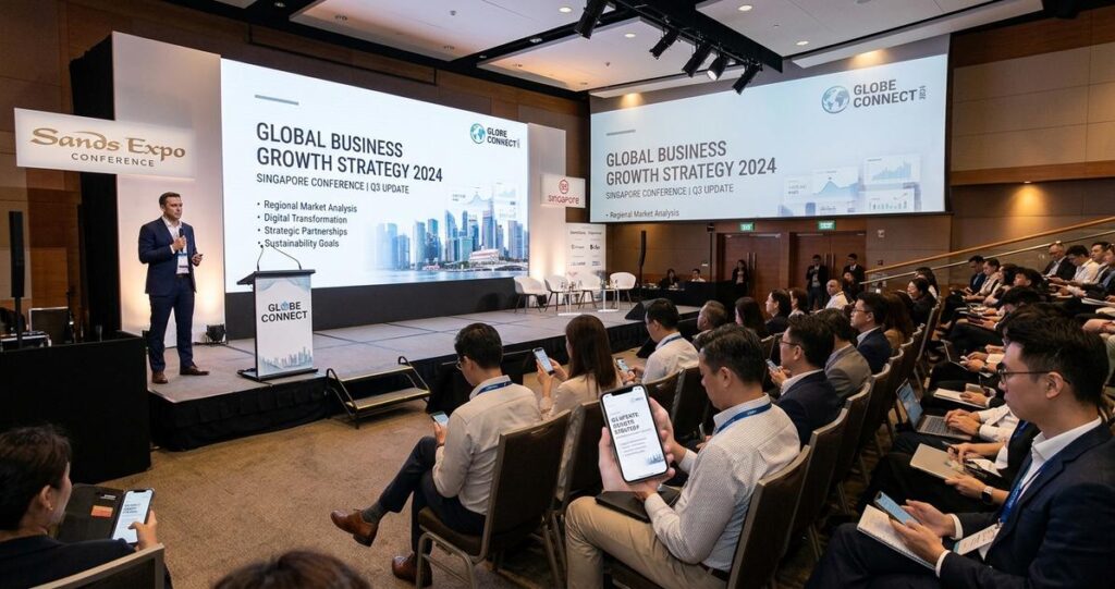
Singapore events often bring together two audiences at once, people seated in a venue and people joining from a phone while commuting, working, or watching between meetings. That creates a practical design challenge that affects nearly every hybrid event, corporate town hall, webinar, product launch, conference, and public education session. A visual that looks polished on a large LED screen may become unreadable on a mobile display, while graphics designed for a phone can feel sparse or underpowered in a ballroom or auditorium. The most effective solution is not to create two disconnected experiences, but to design one visual system that remains clear, legible, and engaging in both environments.
For organisations in Singapore, this matters because hybrid viewing has become a normal expectation in business, education, healthcare communications, and public-facing events. Teams may attend from Marina Bay offices, co-working spaces, or home, while some guests are physically present in the room. In this setting, visual communication is not just about aesthetics. It supports comprehension, retention, accessibility, and brand credibility. If the design is too dense, too small, or too dependent on a single screen size, the message is weakened before the content is even understood.
Designing for both in-person and mobile viewers requires a blend of information hierarchy, typography, motion planning, content discipline, and technical awareness. The goal is simple: every audience should receive the same core message with minimal friction. The details are where success happens.
Why hybrid visual design needs a different approach
Traditional event visuals were often built with only one primary display in mind, usually a stage screen, projector, or printed backdrop. Mobile viewers changed the equation. A smartphone compresses the viewing area, changes how people scan information, and introduces distractions such as notifications, movement, and low-light environments. A slide that depends on small annotations, subtle contrast, or dense tables may still be acceptable from the front row, but it can become unusable on a mobile device.
In Singapore, this issue is especially relevant because many professionals use mobile devices as a default access point for digital content. During transit on the MRT, in office lobbies, or between client meetings, viewers often consume event content in short bursts. That means the design has to communicate quickly and clearly even when attention is fragmented. For in-person audiences, the same visual must also support room-scale readability, where people may sit at different distances from the stage. Good hybrid design works across both ends of that spectrum.
The best starting point is to treat the event visual as a communication system, not a decorative layer. Each slide, lower-third, title card, or motion graphic should answer one question first: what must the viewer understand immediately? If that answer is unclear, the design is carrying too much burden.
Build a clear visual hierarchy before adding style
Visual hierarchy refers to the order in which a viewer notices information. In practice, it means making the most important message the most prominent, followed by supporting details, and then optional context. This principle is critical for hybrid events because both large-screen and mobile audiences need a fast route to meaning.
Prioritise one idea per visual frame
Each slide or visual frame should usually communicate one main idea. If the screen tries to show a full paragraph, multiple charts, a speaker name, a logo, and several disclaimers at once, the message competes with itself. In-person viewers may be able to glance at the stage and still follow along, but mobile viewers usually cannot. A cleaner hierarchy, with a headline, one supporting point, and only the essential context, improves comprehension for everyone.
This does not mean oversimplifying content. It means separating information into meaningful layers. For example, a conference presentation can show a headline on screen while the detailed explanation is delivered by the speaker. If extra context is necessary, consider placing it in the event app, downloadable handout, QR code, or follow-up email rather than forcing it into the visual itself.
Use size and spacing as part of the message
Typography size, line spacing, and spacing between elements are not merely design preferences. They determine whether the viewer can process information quickly. Mobile screens reward strong contrast and generous spacing, while large venue screens benefit from bold, legible type and limited text density. Crowded layouts make both groups work harder than necessary.
A practical approach is to test whether the visual still makes sense when viewed quickly from a distance or at a reduced scale. If key words disappear, if lines merge together, or if the layout feels cluttered at a glance, the hierarchy needs adjustment. A design that feels elegant but takes too long to read has failed its communication role.
Typography and colour choices that stay readable on every screen
Typography is one of the most important factors in hybrid visual design. Sans-serif fonts are commonly used for digital and event graphics because they tend to remain legible at a distance and on smaller screens. That said, font choice alone is not enough. Weight, spacing, contrast, and alignment all contribute to readability.
Choose typefaces that remain clear at small sizes
For mobile viewers, letterforms need to stay distinct when the screen is reduced. Thin weights, decorative scripts, and overly condensed fonts can lose clarity. For in-person audiences, especially in larger rooms, the same issue appears when text sits far from the viewing position. Select fonts that are clean, open, and consistent across weights. Use bold styles for emphasis rather than stacking multiple font families without purpose.
Also consider line length. Long lines can be tiring to read on a phone, while very short lines can make stage screens feel awkward. A balanced layout avoids dense paragraphs and makes generous use of white space, which is the empty area around text and images. White space helps the eye identify what matters most.
Use contrast deliberately, not decoratively
Colour contrast is essential for accessibility and legibility. Light grey text on a white background, or white text over a busy image, can be hard to read on any device. For hybrid visuals, contrast should be checked under both bright venue lighting and smaller mobile displays. A design that looks fine on a calibrated monitor may not perform well in the real world.
High contrast does not mean harsh design. It means the viewer can immediately distinguish foreground from background. When brand colours are part of the visual identity, use them in ways that preserve readability. If necessary, place text on solid or lightly blurred overlays, and avoid placing important text directly over complex photographic backgrounds.
Account for audience context in Singapore
Singapore event spaces vary widely, from hotel ballrooms and convention centres to office boardrooms and smaller seminar rooms. Lighting conditions, screen size, and ambient brightness can differ significantly. A visual system should therefore be tested in more than one context. What looks sharp in a studio or internal review may appear washed out under venue lighting or compressed in a mobile stream.
For multilingual or mixed-audience events, readability becomes even more important. If a visual includes English plus another language, keep the translation structure clear and avoid overcrowding the frame. Separate language versions may be more effective than forcing too much text into one layout.
Design motion graphics and layouts for live and mobile attention patterns
Motion can improve comprehension when used thoughtfully. It can also create distraction when it is too fast, too frequent, or visually busy. In a hybrid event, motion graphics should support the spoken message and give viewers enough time to absorb key information, whether they are in the room or watching on a phone.
Keep movement purposeful and controlled
Animations should introduce information in a structured way, not reveal everything at once or bounce elements around unnecessarily. Slow, clean motion helps guide attention, while rapid transitions can make it difficult for mobile viewers to follow. For in-person audiences, motion also needs to account for sightlines and screen placement, especially if the venue is large or the main display is elevated.
If an event includes captions, lower-thirds, speaker identifiers, or agenda prompts, make sure these elements stay on screen long enough to be read comfortably. In live production, timing should support real reading speed, not just visual rhythm. This is especially important when the audience includes viewers with different levels of familiarity with the topic.
Design for partial attention without losing the message
Mobile viewers often experience content in an environment with interruptions. They may be checking messages, moving between locations, or watching with audio muted for part of the session. Visuals need to communicate effectively even when attention is not continuous. That means key points should be reinforced visually, not only through narration.
Simple charts, direct labels, and concise on-screen text are often more effective than abstract diagrams that require long verbal explanation. When using data visuals, label axes clearly, avoid overcrowding, and highlight only the figures that matter most to the message. If a chart is too detailed for a small screen, consider reformatting it into a simplified graphic or splitting it into separate visuals.
Plan content so the same core message works in both venues
One of the most common mistakes in hybrid event design is trying to make a single slide do too many jobs. A stage screen, a mobile screen, and a speaker’s talking points do not always need identical formatting, but they do need the same core narrative. The best results come from planning content architecture before production begins.
Separate essential content from supporting detail
Every visual should distinguish between essential information and secondary material. Essential information includes the title, key message, speaker name, date, time, or call to action. Supporting detail might include extra notes, references, or supplementary instructions. If the support material is not necessary for immediate understanding, it can often live elsewhere.
This approach helps audiences who are joining late, catching up on a mobile stream, or sitting farther from the screen. It also reduces the risk of cognitive overload, which happens when viewers receive more information than they can process at once. Clear content planning is often the difference between a polished hybrid event and a confusing one.
Use templates that respect different aspect ratios
Many event teams still create visuals in a single default layout and then crop or stretch them for other uses. That usually causes problems. A composition that is balanced for a wide stage screen may lose important content when adapted for vertical or square mobile formats. Likewise, a mobile-first visual may look sparse on a large screen.
Instead, plan adaptable templates from the start. Build safe zones for text, logos, and faces. Keep critical content away from the edges where it may be cropped. If the event includes live streaming, side-by-side layouts, speaker windows, or social clip versions, each format should be checked before the event day. This is a production discipline issue as much as a design issue.
Practical production checks that prevent avoidable problems
Good visual design only works if it survives real-world production conditions. That means testing on actual screens, under actual lighting, with actual content. A final file that looks perfect on a laptop can still fail when projected, streamed, or compressed by platform settings.
Test at the smallest and largest practical view
Review the design on a phone and on the venue display, not just on an editing monitor. Ask whether the main message is still obvious after a quick glance. Check whether logos remain crisp, whether faces are recognizable, and whether text holds up when the viewer is several metres away. If the design depends on zooming in, it is not ready for hybrid use.
It also helps to test with different team members, because people notice different issues. Someone who understands the content deeply may overlook clutter that a first-time viewer catches immediately. Fresh eyes are valuable in production review.
Watch file quality, compression, and captions
Hybrid events often pass through multiple technical systems, including presentation software, streaming platforms, and venue playback equipment. Compression can reduce clarity, especially for fine text and thin lines. Design choices that look elegant in a graphics file may break down after export. Keep typography bold enough and avoid intricate details that may not survive compression well.
If captions are used, they should be accurate, well timed, and placed so they do not block essential visuals. Captions improve accessibility for Deaf and hard-of-hearing viewers, and they also help mobile viewers in noisy environments or muted playback situations. In a bilingual or multilingual event, caption strategy should be planned early, not added at the end.
Align design with accessibility expectations
Accessibility is not a separate aesthetic track. It is part of effective communication. Sufficient colour contrast, readable text, logical layout order, and clear labelling all support a wider audience. People with low vision, older attendees, and those viewing on smaller devices all benefit from the same decisions.
For Singapore organisations, this is especially relevant in public education, corporate communications, and community-facing events where the audience may span several age groups and digital comfort levels. A thoughtful layout shows respect for the viewer’s time and attention, and it reduces the likelihood of misunderstanding.
Designing visuals that work for both in-person and mobile viewers is ultimately about discipline. It requires restraint, clear priorities, and a willingness to simplify without losing meaning. When the audience can understand the message quickly, the design has done its job.
For organisations planning hybrid events in Singapore, the best next step is to build a repeatable design process. Start with a content hierarchy, choose readable typography, test colour contrast, plan for multiple screen sizes, and review visuals on both phone and venue display before the event. If your production includes live streaming, speaker support, or branded motion graphics, involve your creative and technical teams early so the visual system is consistent from rehearsal to broadcast. This is how an event becomes easier to follow, more professional to watch, and more effective for every attendee, regardless of where they are viewing from.
General information only, not medical advice. If a viewer has specific visual accessibility needs, organisations should consider professional accessibility guidance and event-specific consultation.

Jeremy Lee is a seasoned digital marketing director and strategist with over two decades of experience in the industry. As the founder of Sotavento Medios, I manage a diverse portfolio of over 50 businesses, helping brands grow through advanced search strategies and digital innovation. My work focuses on bridging the gap between traditional search engine optimisation and the evolving world of AI-driven answer engines.
get in touch