
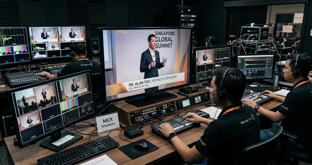
For Singapore-based organisations running regional hybrid broadcasts, lower thirds may seem like a small design detail, but they carry a large share of the viewer’s first impression. A well-made lower third tells audiences who is speaking, what role they hold, and why their perspective matters, all without distracting from the live programme. In a setting where a single broadcast may reach viewers in Singapore, Malaysia, Indonesia, Hong Kong, and beyond, the design must work across different languages, screen sizes, and viewing environments. It also needs to remain readable on laptop screens, mobile devices, and large venue displays, while fitting the organisation’s brand and the production’s technical constraints.
Professional lower thirds are especially important in hybrid broadcasts because they bridge in-room and remote participation. When a speaker joins from a studio in Singapore, a hotel ballroom in Marina Bay, or a home office in another regional city, the audience depends on on-screen graphics to orient themselves quickly. If the typography is too small, the colours lack contrast, or the animation is overly flashy, the message becomes harder to follow. In practical terms, lower thirds are part of broadcast communication, not just decoration. For Singapore audiences accustomed to polished corporate events, government briefings, investor presentations, and professional webinars, the standard should be clear, disciplined, and consistent.
Designing these graphics also requires a strong understanding of compliance, cultural sensitivity, and operational realities. Singapore is multilingual and highly connected to regional markets, which means lower thirds may need to accommodate English, Chinese, Malay, or other scripts depending on the programme. The production team must also consider accessibility, because some viewers will rely on the graphic to identify a speaker in a noisy venue or on a small phone screen during their commute. A strong lower third supports comprehension. A weak one creates friction at exactly the moment the audience should be focusing on content.
What makes a lower third effective in a regional hybrid broadcast
A lower third is the on-screen text and graphic element typically placed in the lower portion of the frame to identify a person, role, company, topic, or location. In broadcast and live production, it must be legible at speed, visually balanced, and technically reliable. In a regional hybrid setting, effectiveness depends on more than appearance. The graphic must survive varied encoding quality, different aspect ratios, and the reality that remote speakers may appear in a windowed layout, a picture-in-picture format, or a full-frame speaker shot.
For Singapore productions that serve a regional audience, the main goal is consistency. When a lower third appears, viewers should immediately understand who is speaking, without having to decode decorative elements or wait for the text to linger too briefly. The best designs are often restrained. They use a clean hierarchy, a simple typeface, and enough spacing to prevent visual crowding. A lower third that looks good on a designer’s desktop can fail in a live broadcast if it is not tested on actual delivery outputs, including streaming encoders and venue screens.
Prioritise legibility over decoration
Legibility is the first rule. Fonts should be clear at small sizes, with sufficient stroke weight to remain readable after compression. Sans serif typefaces are commonly preferred because they hold up well on digital displays and streaming platforms. Avoid overly thin fonts, script styles, or excessive letter spacing that reduce readability. Use sentence case or standard name formatting rather than all caps for long phrases, since all caps can appear visually heavy and slower to read.
Contrast matters just as much as font choice. White or light text on a dark panel, or dark text on a light panel, is usually more effective than relying on coloured text alone. If a brand palette uses strong colours, apply them as accents, borders, or subtle background blocks rather than allowing them to compromise readability. For regional hybrid broadcasts, the content needs to remain readable under variable lighting conditions, including bright hotel ballrooms in Singapore, dimly lit conference theatres, and home-office environments.
Keep the information hierarchy simple
Every lower third should answer the audience’s immediate question in the shortest possible format. For speaker identification, the primary line usually contains the person’s name, while the second line contains their title or organisation. If the event requires a third line, such as a department, country, or topic, it should only be included when necessary. Too much text weakens the graphic and increases the risk of truncation, especially for longer regional job titles.
Singapore productions often work with regional executives, medical professionals, government representatives, and academic speakers whose titles can be lengthy. The design should anticipate this. Use a clear hierarchy so that the name receives priority, followed by role and affiliation. If a longer title does not fit comfortably, consider shortening the role while preserving meaning, for example using “Regional Director” rather than a full corporate department line, if the context allows it.
Designing for multilingual and cross-border audiences
Singapore’s regional production environment often includes audiences and speakers across multiple languages and scripts. This does not mean every lower third must be bilingual, but it does mean the design should be flexible enough to support different character sets and line lengths. A lower third that works for English names may not work for Chinese names rendered in a different font, or for titles that are longer in translation. The safest approach is to create a template system, not a single static graphic.
Broadcast teams should test the graphic family across the languages most likely to appear in the programme. Fonts must support the necessary scripts without inconsistent line weights or awkward spacing. When working with mixed-language events, align text carefully so the layout remains balanced even when one language occupies more horizontal space than another. Where needed, use separate language versions of the lower third rather than overloading one graphic with too much information.
Plan for text expansion and localisation
Text expansion is a common issue in multilingual production. A title that fits neatly in English may become much longer when translated. For that reason, design with extra horizontal breathing room and avoid locking text into a rigid shape that cannot scale. Localisation is not just translation. It includes formatting names correctly, respecting order conventions, and making sure the on-screen label feels natural to the intended audience.
For Singapore-based production teams, this is particularly relevant when working on regional summit livestreams, government forums, medical conferences, or investor relations events. A title such as “Chief Executive Officer” may be shortened to “CEO” if the event style allows it, but only if the abbreviation is understandable to the audience. If a programme includes simultaneous interpretation or language switching, coordinate the lower third system with the show caller and graphics operator so that labels appear in the correct language and at the correct time.
Respect cultural and professional context
Lower thirds should be culturally neutral unless the event calls for a specific visual identity. Colours, icons, and transitions should not overshadow the speaker or introduce unintended associations. In a regional corporate or institutional setting, overly playful animation can undermine credibility. A disciplined visual language is usually more effective for Singapore audiences, especially in finance, healthcare, education, government, and B2B conference settings. Professionalism is communicated not by complexity, but by precision.
It is also helpful to consider name presentation carefully. Use the spelling provided by the speaker or organiser and confirm honourifics, professional credentials, and organisation names before the event. Inaccurate titles can damage trust faster than poor styling. In live hybrid broadcasts, a graphics operator should work from an approved rundown or speaker sheet, not from memory.
Technical standards that protect broadcast quality
Even the most polished design will fail if it is not built for live operation. In hybrid broadcasts, lower thirds must function across multiple delivery pathways, including program output for in-room screens, web streaming platforms, and recorded archives. Technical design should account for safe areas, aspect ratios, compression, and latency. A lower third that is too close to the edge of the frame may be cropped on some displays. A design that depends on fine detail may become muddy after streaming compression.
Professional production teams in Singapore often work with LED walls, projection screens, and streaming platforms at the same time. That means the graphic needs to be clean enough for a large display and stable enough for a compressed stream. Keep decorative elements minimal, and make sure the essential text remains the strongest visual element. Motion should be smooth but not excessive. If animation is used, it should support the information, not compete with it.
Build with safe areas and aspect ratio in mind
Safe areas refer to the portion of the screen where text and graphics are least likely to be cut off by different display systems. This is important because broadcast streams, venue screens, and platform players do not always present the image identically. A professional lower third should sit comfortably within the frame, with enough margin to remain readable even if the output is slightly cropped. This is particularly relevant when an event is simultaneously shown on a main stage screen, a breakout-room monitor, and a mobile livestream.
Aspect ratio also matters. While 16:9 remains common, some productions involve vertical or cropped social clips after the live event. Designing a flexible lower third system helps futureproof the asset. Keep the core text compact enough that it can be adapted into different formats without losing clarity.
Test the graphic under real delivery conditions
A lower third should be checked in the same environment where it will be used. Test it on the actual streaming platform, the venue playback system, and any recording workflow. Observe the text at different bitrates and on different screens. If the graphics are designed on a bright editing monitor but viewed on a projected screen in a conference room, the colour and contrast can appear different. That is why a pre-event rehearsal is essential.
Singapore production teams often manage tight schedules and multi-stakeholder approvals, so testing should be efficient but thorough. Confirm spelling, title length, font rendering, timing, and placement before going live. If the event includes remote speakers, test how their video window interacts with the lower third. Some conferencing platforms compress overlays differently, which can affect readability and alignment.
Working with brand identity without compromising clarity
Brand consistency matters in corporate and institutional broadcasting, but it should never reduce usability. The lower third is one of the few on-screen assets that viewers will look at repeatedly, often for only a few seconds at a time. A strong brand system uses colour, shape, and motion in a controlled way. The audience should recognise the organisation’s identity without feeling distracted by it. This balance is especially important in Singapore, where many organisations aim for a premium, understated presentation style.
Brand guidelines should be translated into broadcast-safe design rules. A logo can be included if it is small and unobtrusive. Accent colours can be used if they preserve contrast. Animations can reinforce a brand’s tone, but they should be brief and elegant. If a company has a detailed corporate identity manual, the production team should adapt it to live graphics rather than copying print layouts directly into video.
Use motion with restraint
Animation can make a lower third feel polished, but only when used carefully. A short fade, slide, or reveal is often enough. Overly elaborate motion can draw attention away from the speaker and slow the rhythm of the event. In hybrid broadcasts, where switching between presenters, slides, and audience questions may happen quickly, lower thirds must appear and disappear smoothly. They should never feel like a delay.
The timing should also support speaker flow. If a moderator introduces a guest and the lower third appears too late, the information loses value. If it stays on-screen too long, it becomes visually stale. The production team should coordinate graphics timing with the rundown and rehearsal notes. Good timing makes the broadcast feel organised and trustworthy.
Align the graphic with the event’s tone
Different programmes require different visual language. A financial briefing may call for a restrained, high-contrast lower third. A university panel could support a slightly warmer tone, while a medical conference might benefit from a more neutral and clinical design. The key is alignment. The lower third should reflect the event’s purpose and audience expectations. For Singapore audiences, clarity and professionalism usually outperform novelty.
When a broadcast serves regional stakeholders, the design should also avoid local cues that might confuse international viewers unless those cues are part of the event’s identity. A good rule is to make the graphic locally competent but globally understandable. That makes it easier to repurpose the content across replay clips, social snippets, and archived presentations.
Practical production workflow for Singapore event teams
A reliable lower third system depends on workflow, not just design talent. The design, approval, and playout process must be organised so the graphics team can respond quickly during a live programme. In Singapore’s event environment, where timelines can be tight and stakeholder review cycles can be compressed, clarity in process protects quality. The best teams treat lower thirds as part of event infrastructure, not a last-minute aesthetic task.
Start with a standardised template library. This should include speaker IDs, moderator titles, speaker introductions, panel transitions, and location labels if needed. Each template should be version-controlled and approved by the relevant stakeholders before the event. During rehearsal, verify that names are correct, titles are approved, and any multilingual versions are ready to deploy. Build time for corrections into the schedule, because last-minute changes to titles or speaker order are common in live events.
For regional hybrid broadcasts, coordination between the producer, director, graphics operator, and client contact is essential. The rundown should specify when the lower third appears, whether it changes for each camera cut, and how long it remains visible. If a speaker joins from another country, confirm the preferred title format and the country naming convention in advance. Small details like these prevent avoidable on-air errors.
Good lower third design is ultimately about helping the audience follow the conversation without strain. For Singapore audiences who expect precise, polished communication, that means designing for readability, cultural flexibility, technical resilience, and brand alignment at the same time. The strongest graphics are often the ones viewers barely notice because they work so well.
For organisations planning their next hybrid broadcast, the practical takeaway is straightforward. Build lower thirds that are simple enough to read instantly, flexible enough to support regional and multilingual use, and robust enough to survive live production conditions. Test them on real screens, confirm every name and title, and keep the design disciplined. When those pieces come together, the broadcast feels more credible, the message lands more clearly, and the audience can focus on what matters most, the speaker and the content.
Jeremy Lee is a seasoned digital marketing director and strategist with over two decades of experience in the industry. As the founder of Sotavento Medios, I manage a diverse portfolio of over 50 businesses, helping brands grow through advanced search strategies and digital innovation. My work focuses on bridging the gap between traditional search engine optimisation and the evolving world of AI-driven answer engines.
get in touch